


For decades Pantone’s Colour of the Year acted as a trend forecaster for interior and fashion designers as well as consumers and experts within multiple industries.
At the beginning of every New Year, more than 10,000 designers and producers wait in anticipation to hear what the latest colour craze would be to get their businesses up and running in line with the “in-thing” to do.
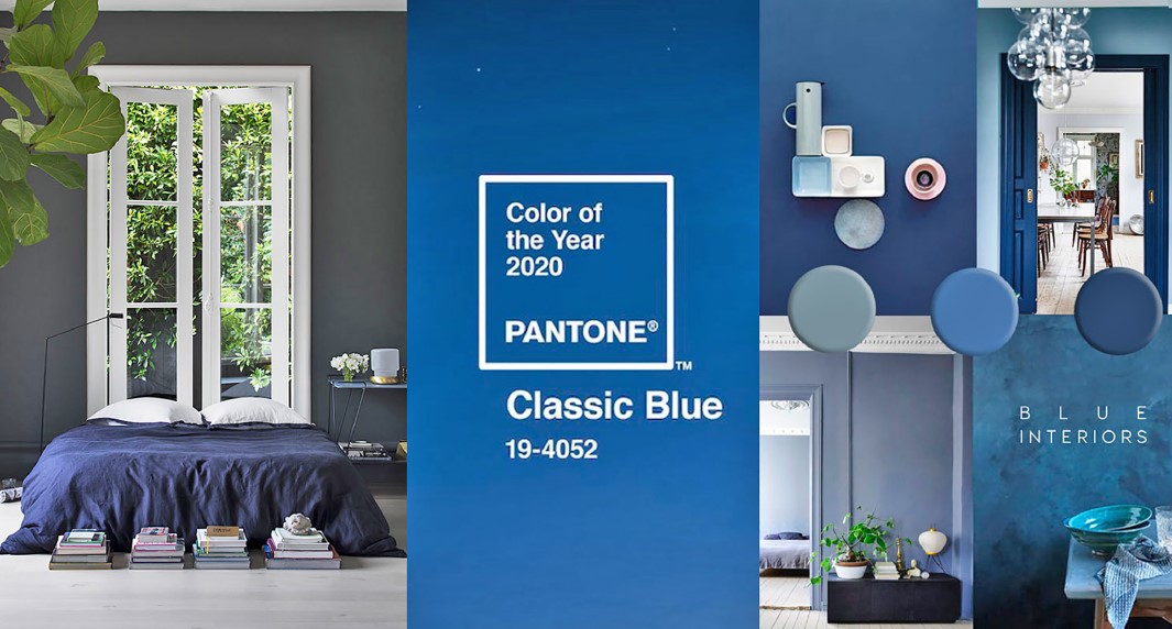
In 2019, a vibrant living coral stole the show and the year before that designers gushed over purple and violet hues. This year, classic blue makes its comeback and according to the Pantone website, it is “a timeless and enduring blue that is suggestive of the sky at dusk”.
Leatrice Eiseman, executive director of the Pantone Colour Institute, said: “Imbued with a deep resonance, classic blue provides an anchoring foundation. A boundless blue evocative of the vast and infinite evening sky, it encourages us to look beyond the obvious to expand our thinking; challenging us to think more deeply, increase our perspective and open the flow of communication.”
Classic blue is a subtle hue that is said to reflect a sense of calmness and serenity making it suitable for creating a collected atmosphere at home combined with added sophistication.
Designers, in particular, adore the rich, dark blue for its versatility.
For example, Caitlin Murray, founder and designer at Black Lacquer Design in Los Angeles, told the Insider website, that she is a fan of incorporating the shade by way of large furniture pieces while interior designer Jared Epps, owner at JSE Design in Brooklyn, New York, often uses the shade as an accent paint colour, but that he’s also used it as the main colour for a space. Naturally, that all depends on the type or size of the room.
It makes sense to either paint with classic blue or add furniture pieces and accessories to a room as the shade brings forth a sense of peace, tranquility and refuge. It also aids concentration, helps to provide clarity and to centre thoughts. This colour is suitable for any room be it the bedroom, bathroom, kitchen or even the office.
Here are three ways to use this hue when decorating your home:
Make a statement:
I’ve said it time and time again; paint is the quickest and cheapest way to revamp a space. Splash some classic blue on a wall to create an ambience of classiness and liveliness. Paint one wall or use complementary colours in the same palette on different walls to brighten the room.
Comfy cushions and furnishings:
This shade is both décor-friendly and offers a sense of cosy comfort to any dwelling. Add a throw pillow or artwork in that colour to your living room or place a rug or sofa set to tie other elements together.
Excitable exterior:
The colour can be used outside too on front doors, window panels or patio benches. It’s a refreshing shade that can complement any season.

